In the fast-paced world of trading, spotting the right opportunities at the right time can make all the difference. One such opportunity is the Golden Cross, a powerful technical pattern that has long been considered a reliable bullish indicator. When it appears on a chart, it signals a potential uptrend, prompting traders to take notice.
However, what exactly is the Golden Cross, and how can it be used to your advantage? Understanding its formation and the strategy behind it can open new possibilities for traders looking to capitalise on market movements.
 What is Golden Cross's in Trading?
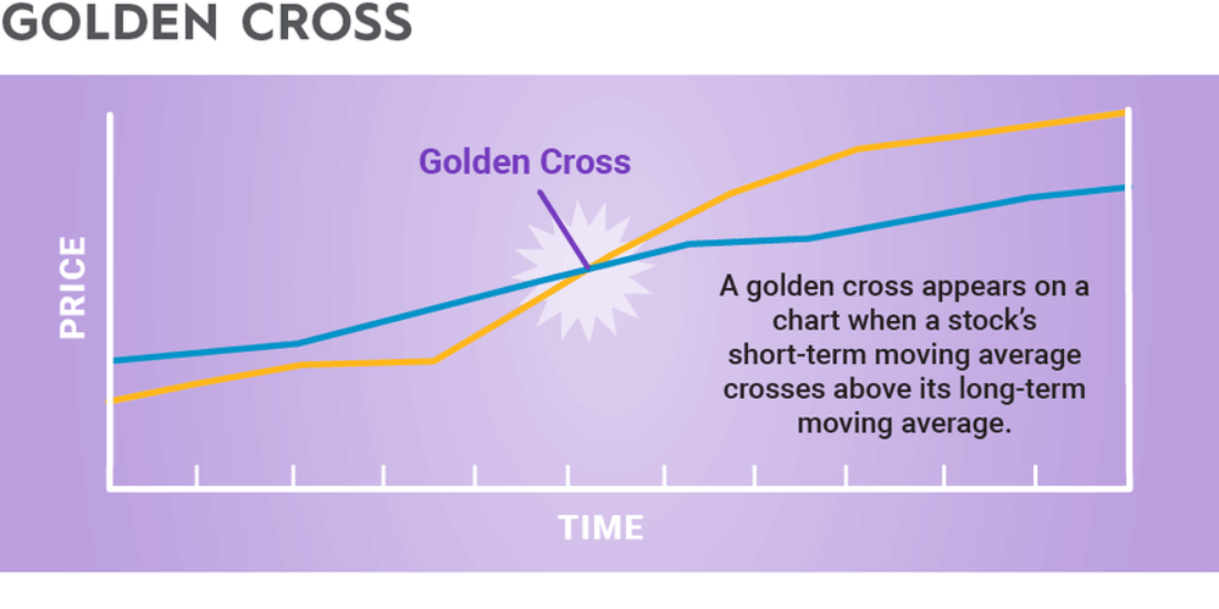
A Golden Cross occurs when a short-term moving average crosses above a long-term moving average, often seen as a signal that an asset is entering an uptrend. In technical analysis, the two key moving averages involved are the 50-day and 200-day simple moving averages (SMA). The 50-day SMA is generally considered a short-term trend indicator, while the 200-day SMA represents a longer-term trend.
This crossover is significant because it indicates a shift in market dynamics. When the shorter-term 50-day moving average rises above the longer-term 200-day moving average, it shows that recent price action is gaining momentum. As a result, market sentiment tends to turn more positive, with expectations of further price increases. For traders, this suggests a potential opportunity to enter the market.
Why does the Golden Cross work so well? The effectiveness of this crossover lies in the principle of moving averages themselves. These averages are based on historical price data, and when the short-term trend overtakes the long-term trend, it signifies a growing presence of buyers, outpacing sellers. This is a classic sign of increasing bullish sentiment, hinting that the uptrend may continue.
How to Identify Golden Cross's on a Chart?
A Golden cross is frequently observed at the end of a downtrend, signaling that the market's short-term momentum is surpassing its long-term momentum, which suggests the start of an upward trend! Identifying this crossover on a chart may seem complex at first, but with a few key steps, you can learn to spot it quickly.
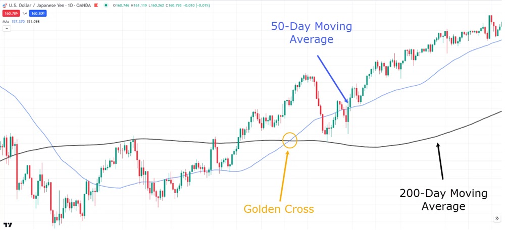
Here is a daily chart of USD/JPY. In this chart, we can see the golden cross occurs when the short-term 50-day moving average crossed above the longer 200-day moving average. After this crossover happened, the price maintained its upward momentum, indicating the beginning of a new upward trend.

However, just seeing the Golden Cross is not always enough to confirm a bullish trend. To validate the pattern, traders often look for increasing volume. Higher trading volumes suggest that there is strong buying interest behind the move, which increases the likelihood of the trend continuing. If you notice rising volumes alongside it, this could offer a more reliable signal for an upward trend.
As the crossover forms, it is also important to monitor how the broader market is reacting. If the stock is breaking out of a consolidation phase and moving to higher levels, the pattern may carry stronger implications. Similarly, if the overall market is in a bull run, this crossover can act as confirmation that the trend will likely continue. Therefore, understanding the broader market context is crucial to making an informed decision.
Finally, the timeframe of the chart plays a significant role in identifying this pattern. While the 50-day and 200-day moving averages are mostly used on daily charts, these averages can be applied to different timeframes depending on your trading style. For long-term investors, a Golden Cross on a weekly chart may carry more weight, while short-term traders might find a daily chart more useful for making quicker decisions.
Once you've identified a Golden Cross on a chart, you can consider it a potential sign of upward momentum, provided that other indicators align and confirm the trend.
Golden Cross Trading Strategy
Now that you know how to spot this signal, it's important to think about how to incorporate it into your trading strategy. A Golden Cross is widely considered a buy signal, but it's crucial to approach it with a structured plan to maximise its potential.
Instead of jumping into a trade immediately after spotting the Golden Cross, it's wise to wait for confirmation. This could mean waiting for the price to continue moving higher after the crossover or waiting for a brief pullback before entering the trade. Being patient helps avoid premature entries and can increase the chances of success.
Even when you're confident in your trade, it's essential to manage your risk. After entering a position based on the crossover, it's a good idea to set a stop-loss order just below the most recent swing low. This provides a safety net in case the trend reverses unexpectedly and helps limit potential losses.
While this signal is a strong technical signal, no pattern is foolproof. Consider scaling out of your position as the price rises, taking partial profits at various price levels. This way, you can lock in some gains while leaving room for additional upside potential.
It's also important to remember that relying solely on this pattern may not always produce the best results. Combining it with other indicators, such as the Relative Strength Index (RSI), Moving Average Convergence Divergence (MACD), or trendlines, can help confirm the strength of the trend and reduce the risk of false signals.
For instance, the MACD is a widely used momentum indicator that illustrates the connection between two moving averages of a security's price. It is calculated by subtracting the 26-period EMA from the 12-period EMA, and the result of this calculation is known as the MACD line.
A nine-day EMA of the MACD, known as the "signal line," is then drawn above the MACD line, serving as a potential trigger for buy and sell signals.
Traders typically watch for crossovers between the MACD line and the signal line, as well as divergences from the price movement, to validate trends identified through Golden and Death crosses.
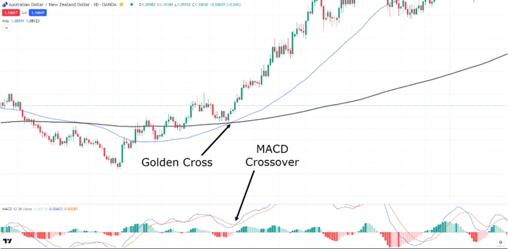
In the chart below, we can see that shortly after the Golden Cross, the MACD also crosses over. This suggests that momentum is strongly in favor of the bulls.

Lastly, always take the broader market context into account. This pattern works best in a market that is already showing signs of strength. If the broader market is in a downtrend, even a Golden Cross may struggle to maintain its momentum. Therefore, it's wise to check the overall market or sector trends to ensure the timing is right for your trade.
Is the Golden Cross a Reliable Signal?
While the Golden Cross can be a highly effective tool for traders, like all technical patterns, it's not foolproof. It's important to remember that no indicator or pattern is guaranteed to work in every situation. False signals can occur, especially in volatile or choppy market conditions.
However, when used properly, the Golden Cross can help identify potential uptrends with great success. By combining it with strong risk management techniques and other indicators, you can increase your chances of making profitable trades.
So, the next time you spot a Golden Cross on a chart, ask yourself: Is the trend truly shifting, or is it just a brief blip in the market? Armed with the knowledge of how to interpret this pattern, you'll be better positioned to make informed decisions and navigate the market's ups and downs.
Disclaimer: This material is for general information purposes only and is not intended as (and should not be considered to be) financial, investment or other advice on which reliance should be placed. No opinion given in the material constitutes a recommendation by EBC or the author that any particular investment, security, transaction or investment strategy is suitable for any specific person.


 What is Golden Cross's in Trading?
